Beaverdam, 12 x 18 inch, Pastel, St.Germain
NOTES
Even though I had a photo, I had to make decisions about a number of things
Color-wise:
My decision was to play up the yellow, red and green colors
All the other colors had to fit around them.
It still made for a serene painting, because
there was still quite a bit of white and shades of gray
Design -wise:
It may work great for a photo, but for a painting
it's kind of tricky to have three "horizons" on top of each other, in an oval frame!
I lowered the bottom part so I would NOT have the beaverdam
cutting through the middle of my paper!
About Focus of Interest:
I had to choose what would be most important for me in my painting.
I didn't think the grey reflections would pop,
when there are so many colors in the surrounding areas
- unless I would paint only part of this scene.
I lowered the bottom part, so I could have the beaverdam
and the reflection of the trees (not seen in the scene) as the focus of interest.

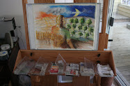
original pic of Becky and Gary at woodynookcreations
Did my painting decisions change the mood of the original photo?
What are your thoughts on it?